Fifty Shades of Black: are your 2D CADs holding you back?
By Brendon Marczan
When I studied fashion design, we didn’t learn any computer-based design. Everything was 2D. My illustration teacher was the lead illustrator for Gianni Versace, so these weren’t just sketches, they were beautiful, highly stylised works of art. That experience landed me my first job at Nicola Finetti, but as I moved around in the design business, I learnt about CAD software on the job.
It was only after one particularly tricky presentation, however, that I began to understand just how much technology could help designers share their vision.
But it’s just black
Sitting in our showroom on a hot August day, my back was sticking to the polycarbonate chairs that some genius thought would bring an artistic touch. It was our second day of line review and energy levels were flagging.
We were rounding out our summer range just prior to pressing go on the factory production in Vietnam. The room was full of prototypes, A3 printed spreadsheets with sell-through results from previous seasons, laptops, calculators and an army of highly strung designers sitting opposite a delegation of temperamental merchandisers, all of us hoping that the day would end.
I had been working on a sneaker design for months but the sample wasn’t ready yet. The fabric around the collar was stuck in customs and this was my last chance to convince our merchandisers to commit to ordering 17,000 pairs. With no sample, I only had my sketches to make my case.
“It’s just like that shiny black style that we put on promotion last season,” said Jean, referring to a failure designed by my colleague.
“Well no, this one is a completely different fabric.” I noticed that my hands were shaking.
“But it looks exactly the same. It’s just black.”
“You have to imagine that this material here is suede and the collar is this new microfibre material with a reflective yarn through it – it’s new tech from 3M.”
“Yeah… I don’t see it.”
Had it been earlier in the day, I’d have done a better job at arguing for my innovative idea but I was exhausted and Jean was right, my illustration just looked like a black blob. She couldn’t see the different textures – and she certainly couldn’t make out the reflective yarn that would glisten in headlights.
It’s a problem that I thought would curse me and my team for eternity: designer with a great idea vs a merchandiser without any vision. But you can’t blame the merchandising team – it’s just not possible for them to understand exactly what you have going on in your head.
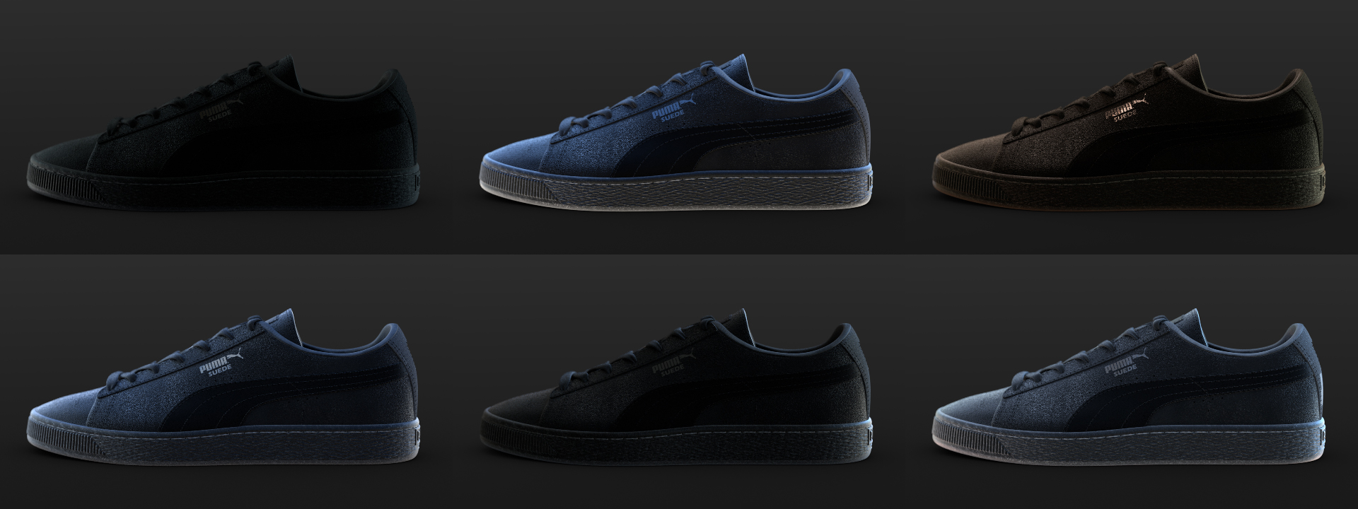
Puma Suede in black showing how lighting can affect how we see colour.
A light at the end of a very, very dark tunnel
I started to explore 3D in early 2017 when I was asked to pack up my life as a product designer in sportswear and move into technology development for Foundry, a visual-effects innovation company in London. The company had a whole bunch of weird and wonderful computer programs that enticed me out of my Adobe Illustrator tunnel vision and into this new, third dimension.
Some of the programs were underdogs, but I could see they had huge potential. Colorway, for example, is an application that creates colorways of any product. I’d never seen anything like it, but I knew straight off it would be a godsend for computer-challenged designers like me. It seemed to me that 3D could make communication faster and clearer, massively improving the presentation process for designers – and merchandising teams.
Foundry was wary of promoting these programs because, at the time, they were still trying to understand how to bring some of their VFX language into the footwear design world. To me, however, they were a brilliant solution. Jean and I could finally be on a level playing field, where she could see exactly what I was trying to offer.
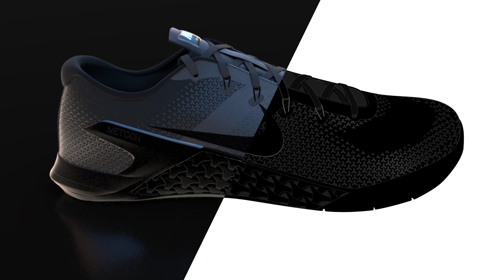
Was the material shimmering or matt? Leather or suede? Canvas or sequins? In 3D, there is no flat black because the light bounces of the surface and photo-realistic reflections emphasise shape and texture. Jean would be able to see everything as it should be. Too bad for Jean that I’d moved onto bigger and better things.
Got any blacker?
I got to test the software’s ability to represent challenging colours when one of our customers, a popular headphone and personal speaker brand, mentioned that its headphone packaging looked completely different in an airport store compared with the design studio. There was also a difference between displays in Walmart and Best Buy. The difference in colour was noticeable and the customers had become confused and frustrated.
The solution we proposed was pretty simple: our creative specialist team took 360-degree images of each of the store locations using a Ricoh 360-degree camera. We created a lighting set-up inside Modo and Colorway that could put each of their headphones in a different store. The designer could literally turn on the lights in the store without having to leave their desk. In some set-ups, we even recreated the warm streetlight that was conflicting with the blue LED from the store.
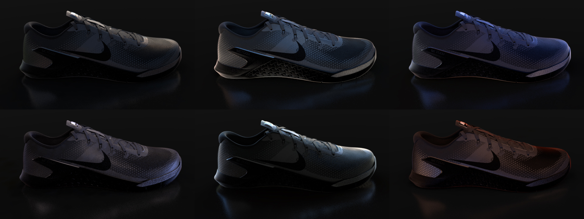
You can see in the images of the shoes above how a simple change in light can affect how we see a black material. In one case a designer decided to change the colour of a set of ear-buds because they looked too green under the LED light (which may have been why they didn’t sell well the previous season). The reaction from the retailers has also been incredible. Imagine how confident they can be in their purchasing decisions! By moving designs into a 3D space, the black you see is, at last, the black the world sees too.
Need help creating 3D models and setting up lighting visualizations? Send me a message at marczan.brendon@foundry.com
The images shown in this article were created entirely in Modo by Ellery Connell and Sergio Madeira.